
Atoti UI Redesign
Enterprise UX • Activeviam
OVERVIEW
AtotiUI is a web-based enterprise analytics platform used by financial institutions for complex data exploration — traders, risk managers, and FP&A analysts building dashboards from large OLAP cubes.
When I joined ActiveViam in 2021, I inherited a product with strong analytical power and a fragmented interface. Over the first two years I led a systematic UI redesign focused on navigation architecture, workspace layout, and a no-code styling system — while establishing the design foundation the product still runs on.
MY ROLE
Sole UX/UI designer
COLLABORATION
Product managers, front-end engineering team
TIMELINE
2 years (ongoing)
THE PROBLEM
The original interface was built around drawer-based navigation — tools, filters, fields, and widgets each lived in separate panels that opened and closed over the canvas. The result was constant context switching: a user building a dashboard had to open the fields drawer, close it, open the widget drawer, close it, open filters. The canvas was never fully visible and the workspace never felt stable.
Two types of users made this harder to solve:
USERS
BUILDERS
Analysts, quants, and technical researchers who understand cube structures and need access to measures, hierarchies, and MDX tools. They were opening and closing drawers constantly.
EXPLORERS
Traders, risk managers, and financial analysts focused on answering business questions. They struggled to understand which drawer held what, and why customization required writing MDX queries at all.
The interface was optimized for neither.
How might we give both user types persistent access to the tools they need, without cluttering the analytical workspace?
WHAT CHANGED
1. FROM DRAWERS TO PANELS
The biggest structural change was replacing the drawer system with a persistent panel layout.
Before
After
LAYOUT AND IA IMPROVEMENTS

NO-CODE STYLING SYSTEM
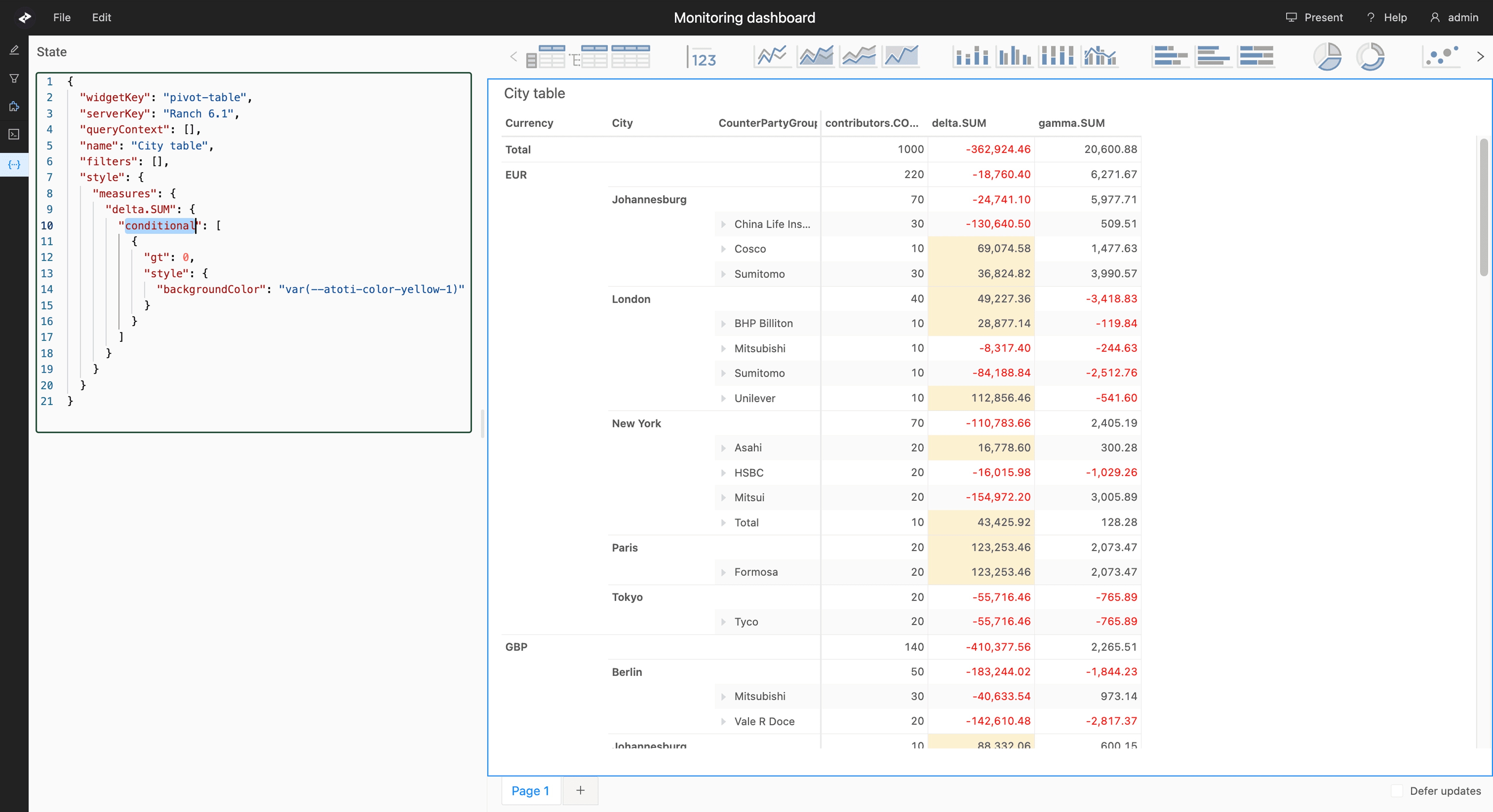
Conditional formatting, date formatting, and table styles previously required writing MDX queries, a significant barrier for non-technical explorers.
I introduced a visual styling editor in the TOOLS panel that makes these options directly accessible. Advanced users can still write MDX, but the interface no longer requires it.
Conditional formatting, date formatting, and table styles previously required writing MDX queries, a significant barrier for non-technical explorers.
Before: Conditional formatting required editing raw JSON:
After: Same rule, now set visually:

OUTCOME
The redesigned interface shipped across versions 5.1 to 5.3, adopted by 33 financial clients including BBVA, Commerzbank, HSBC, and Santander. The panel-driven layout became the product's architectural foundation, every feature since, including the AI analytics work, is built on top of it.
The design system reduced inconsistency across the product and gave engineering a shared language for implementation. What started as a navigation fix became the scaffolding for everything that followed.