
AI-Powered Analytics
Enterprise UX • Activeviam
OVERVIEW
When our company integrated AI into our analytics platform, there were no internal design patterns to draw from and no prior AI product experience on the team. I was the sole designer, working in real time alongside a product manager and AI lead engineer, for a product used by financial institutions.
How might we make AI behavior transparent and trustworthy enough for non-technical users in a high-stakes financial context?
Project thesis:
AI in enterprise analytics needed more than a chat interface, it needed transparency, trust signals, and clear paths to action.
MY ROLE
Sole UX/UI designer
COLLABORATION
PM and AI Lead Engineer
TIMELINE
6 months
THREE DESIGN PROBLEMS
Interaction: How do users communicate with AI?
Transparency: How do users understand what AI is doing?
Action: How do users act on AI-generated insights?
1. INTERACTION: THE AI CHAT INTERFACE
The first version was intentionally minimal, a chat input, a loading state, an error state. We wanted to learn how users interacted with AI before adding complexity.
What we learned:
Users could ask questions, but the response gave them no way to evaluate the AI’s work.
No visible process
No reasoning trail
No trust signal
No clear sense of completion
Design implication:
The AI needed to show enough process to build trust without overwhelming non-technical users.
2. TRANSPARENCY: THE THOUGHT CHAIN
Core design challenge:
How much AI reasoning should we expose to non-technical users?
Two audiences:

Did it succeed?
Is it working?
Is it done?
END USERS

What was called?
What argument?
How long?
DEVELOPERS
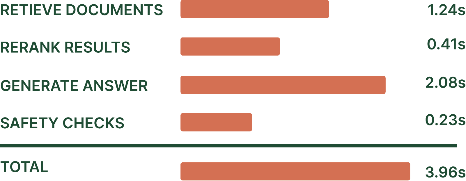
I mapped how existing products handled AI transparency (ChatGPT, Perplexity, Cursor, LangSmith, Zapier) and identified three UI pattern categories for thought chains: Linear Trace, Nested Collapsible, and Timing Breakdown.
Pattern exploration
I reviewed how existing AI products communicated reasoning and grouped their approaches into three recurring interaction patterns.
LINEAR TRACE

NESTED COLLAPSIBLE

TIMING BREAKDOWN
DECISION
Linear trace as the base pattern, with collapsible action nodes that carry data payloads. Thinking steps and the answer node stay flat. Their value is in the label, not hidden content.
KEY DECISIONS
The final interaction pattern balanced transparency with simplicity through four implementation decisions.
Collapse only action nodes that contain meaningful payloads.
Auto-collapse completed steps to reduce visual noise during streaming.
Use a distinct final answer node to clearly signal completion.
Write labels in plain language using continuous verbs instead of technical jargon.
3. ACTION: AUTO-EXPLAIN
Core problem:
Auto-explain was designed as a fire-and-forget feature, giving users no control over scope or sensitivity. Every configuration lived in a backend file that only engineers could modify, so adjusting results required filing a request and waiting, breaking the "on-the-fly" analysis the feature was meant to support. On large cubes, running Auto-explain across every hierarchy could also be slow and generate more noise than insight.
Three decision points, each showing the rejected option vs. the chosen direction and the reasoning behind it.
DECISION 01 — Configuration location
✗ REJECTED
Widget cog, top nav, global settings
✓ CHOSEN
AI panel header: configuration lives inside the AI workspace without taking users away from the current task.

Why: Keeps configuration close to AI behavior without interrupting the user's workflow.
DECISION 02 — THE CONFIGURATION GATE: FIRST-TIME USERS
✗ REJECTED
• Hard setup gate before first use.
• Blocks discovery and slows adoption.
✓ CHOSEN
Show an inline warning with two options:
• Run anyway
• Configure
Users can try the feature immediately.

Why: Encourages exploration while avoiding unnecessary setup friction.
DECISION 03 — PRESERVING INTENT WHEN THE USER CLICKS CONFIGURE
Opening Configure risked interrupting the user's current task.
✗ REJECTED
• Warning on a blank new page — opening a page implies commitment; user lands confused and must navigate back
• Keep context menu open during config — fights OS and browser conventions; technically fragile and visually awkward
✓ CHOSEN
Persistent banner pill + cell memory, context menu dismisses naturally.
Selected cells stay highlighted.
Banner reads "Auto explain 2 selected — Configure in AI panel →" until preferences are saved.

Why: Preserves user context so configuration feels like part of the task instead of a detour.
AUTO-EXPLAIN PROTOTYPE
WHAT THIS ESTABLISHED
A reusable transparency pattern for AI workflows.
A clearer model for configuring AI behavior.
A path from AI response → user action.
Interaction rules engineers could implement consistently.
OUTCOME
All three features are in active development. The thought-chain design has been implemented and is being iterated on with the engineering team. Auto-explain design decisions have been documented and are currently in the engineering hand-off phase. Formal user feedback is forthcoming as the features move toward client release.
REFLECTION
What I learned:
Designing AI required studying interaction patterns before inventing new ones.
Internal validation accelerated iteration, but real users remain the true test.
Edge cases uncovered new opportunities for the next design cycle.
AI interfaces earn trust by revealing just enough process, not every technical detail.